Planning and Research- Poster.
Research.
Photographer Research.
Additionally to the film poster research, since we already
had an idea in mind, we have decided to look at photographers which
present a similar style to what we are trying to achieve. We have looked
at the contrast of light/shadows as well as the overall darkness and
the surrealistic ideas, which we we desire to imitate. Being familiar
with a photographer named Luca Pierro, we have thought about exploring
his style as well as performing a variety of experiments; test shoots, surrealistic photoshop modifications which will help us with creating our own concept of the film poster.
Luca Pierro.
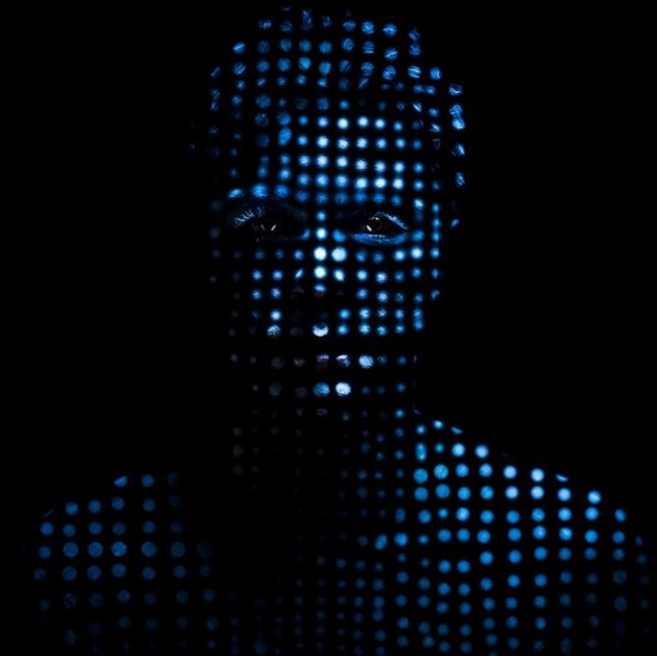
_Luca Pierro presents a variety of 'facets of human nature' through the use of distinctive colour and emotions in each of his expressive photographs. His work requires plenty of skill but also imagination which is used to open and introduce us to Pierro's world. It is often said that the effects captured in his images are skillfully manipulated with the use of Photoshop but surprisingly Pierro's photographs consist of natural elements like flour , water or milk which he uses in an extremely creative aspect.Known for his self-portraits , Pierro displays a distinctive style which is clear amongst his photographs. The body evidently becomes a form of expression , the traditional portraits are modified skillfully and therefore gain meaning. Some pictures are even taken underwater using the macro setting , the shutter is increased and as a result the attention is immediately transferred onto the clear detail of water and it's movement. The imagination behind each of his photographs creates an individual style which he uses to create a powerful statement. His work pushes the boundaries and create a contrasting meaning to the word 'portrait'. Pierro's photographs question the sense of identity : human's insecurities , fears or even personality is uncovered and displayed through the use of natural elements from the earth. Those elements are exaggerated in order to make a statement and this is what we particularly liked about his photographs. In order to form a variety of ideas he evidently thinks outside of the box carefully considering the overall concept , colour scheme and props. His work is a great inspiration for our film poster and as a whole enabled us to notice the importance which the overall idea and the creativity of its execution has on the final product.
|

|

|
Experimentation/ Working in the Style.

|
Luca Pierro presents a variety of 'facets of human
nature' through the use of distinctive colour and emotions in each of
his expressive photographs. His work requires plenty of skill but also
imagination which is used to open and introduce us to Pierro's world. It
is often said that the effects captures in his images are skillfully
manipulated with the use of Photoshop but surprisingly Pierro's
photographs consist of natural elements like flour, water or milk which
he uses in an extremely creative aspect. Known for his self-portraits,
Pierro displays a distinctive style which is clear amongst his
photographs. The body evidently becomes a form of expression, the
traditional portraits are modified skillfully and therefore gain
meaning. Some pictures are even taken underwater using the macro setting, the shutter is increased and as a result the attention is immediately
transferred onto the clear detail of water and it's movement. The
imagination behind each of his photographs creates an individual style
which he uses to create a powerful statement. His work pushes the
boundaries and create a contrasting meaning to the word 'portrait'.
Pierro's photographs question the sense of identity: human's
insecurities, fears or even personality is uncovered and displayed
through the use of natural elements from the earth. Those elements are
exaggerated in order to make a statement and this is what we
particularly liked about his photographs. In order to form a variety of
ideas he evidently thinks outside of the box carefully considering the
overall concept, colour scheme and props. His work is a great inspiration for our film poster and as a whole enabled us to notice the importance which the overall idea and the creativity of its execution has on the final product.

|

|
As we were successful in terms of the replication of
Pierro's style of photography , we were positive that this is the exact
lighting style and the effect which we would definitely use in our final
film poster. The overall contrast between the
light and shadows as well as the eerie and mysterious effect which his
photographs create are the aspects that we desire to form. However
instead of replicating his exact style , we have decided to create our
own interpretation of his work ; keeping the overall lighting style yet
changing the composition , costumes , the model as well as the entire
concept of the photoshoot. Additionally , we desire to reinforce the
idea of clones which is ultimately the main theme
within our teaser trailer and therefore we are positive that we will
have to photograph the protagonist from a variety of angles. Ranging from shots of the model from their shoulders or the waist up as well as a full body shot which we will alternate
between and present in order to create the 'clone effect' , that will
enables us to give the audience the basic idea of the storyline through
the photographs itself.
Film Poster Research.
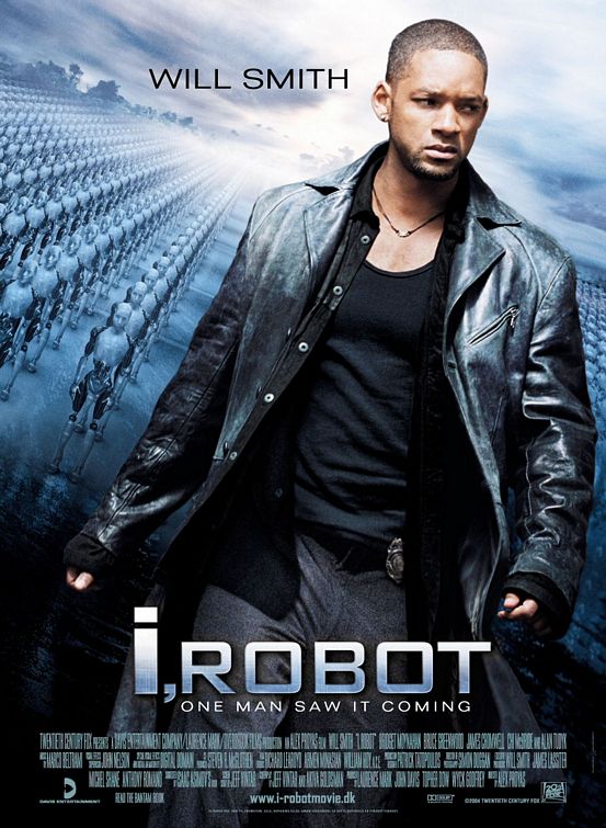
i,Robot.The poster of ' I, Robot' evidently represents the sci-fi genre through the elements included which as a result convey to the audience the basic idea of the storyline. The main image itself presents the protagonist of the film (Will Smith) in a dynamic way which has been achieved through a shot of him walking that combined with what seems like a determined facial expressions help to imply the idea of a mission, the character being ready to face his enemy. Since Smith's character is brought to the forefront of the poster, it enables the audience to understand that he might perhaps be stronger and evidently more powerful that the robots behind him thus implying his ability to overcome or beat these creatures. The composition plays a significant role within film posters, as for example if the main character was placed in the background behind the robots, it would show them as stronger and the protagonist as weak and clearly a victim. This shows how important the overall composition of the poster is and the meaning which it has the ability to create. For that reason we believe it is important for us as a group to carefully decide on which characters are going to presented within the poster as well as how; composition, colour scheme , costume , facial expressions.
The costume possessed by the main character additionally emphasizes his role within the film. The black leather coat, almost agent like which enables the audience to see him as a character who is in control as well as powerful. This aspect is further emphasized by the badge on his belt that suggest his involvement with the police which as a whole gives him a higher status and reassures to the audience the strength and importance of his character. The black vest top appears to be tight against his body, which shows off the muscles and additionally presents an aspect of strength and power. Seeing the impact and the effect which the costume of the character makes such as giving away aspects of his background and role within the film, we believe that the costume of our protagonist has to be carefully planned out in order to achieve a similar effect. |
|
Top Half
As this poster presents only one character, the consumers are straightaway able to see who the evident protagonist within the narrative is. For this reason, following the convention’s of film posters, ‘Will Smith’s name is right at the top of the ‘I, Robot’ poster, clearly visible on the left corner. This plays a significant role in terms of marketing of the movie as in many cases the cast of the actual film is able to persuade the consumer to go and watch it, more than the storyline or the concept itself. Using this idea, Smith’s name is presented in bold letters promoting not only the film but also him as an actor. Since the letters are black, it quite clearly stands out from the background as well as the colour itself connoting death. As a result, we are being subtly presented with an idea that he will destroy the robots, which are placed behind him in the poster, thus making him the hero of the film. The colour significance plays an important role within this poster, which is additionally emphasized by the grey colour that is seen to dominate and create a dark atmosphere surrounding the film. This is highlighted by the grey clouds in the background of the poster that are often seen before a heavy rain. We could connect this to Will’s facial expression; looking annoyed or perhaps angrily to the side, evidently avoiding looking into the camera. As the poster does not contain any element, which could explain his annoyance apart from the robots, it creates a mysterious feel that allows the consumers to guess what the narrative of the film is about. This had allowed us to see the importance of composition of the main character within the poster as well as the overall colour scheme, which runs towards both poster and the teaser trailer. Similarly to the trailer, the poster is only giving hints to the audience rather than revealing the main storyline, which is why a poster requires to keep the audience guessing and that is an element that we desire to reinforce within our poster.
Background.
|
The background of the 'I , robot' poster presents the perfectly
created robots in a distance. The blue tint appears to dominate and be
the main colour within this poster. Not only does this help to reinforce
the sci-fi genre of the film itself but also makes the overall poster
appear modern hinting at the time in which the film is set. Small
details , which may seem insignificant such as the fog in the background
are important in the way the poster is understood by the audience. As a
whole, it suggest the endless number of robots creates and despite
being unable to see each one in particular, we know they are there. The
positioning of the robots is additionally an important aspect;
standing in a perfect line almost army like, presenting a possible war
that might be the key event within the film. Similarly despite being in
the background the robots are seen to be in control as they are on their
own, outside which implies that they might have escaped and they have
the ability to do anything they possible want to.
|

|
Title.

Having the title of the
film placed at the bottom of the poster appears to be effective as it
helps to emphasize the protagonist (Will Smith) and the robots, which
are the main focus of the poster, without covering it up. The font
itself remains significant as it helps to highlight the main themes of
the film. It conveys a technology/computer like feel which indicates the
narrative containing an aspect of technology of some sort that
additionally links with the robots presented in the background.
Similarly the colour of the font evidently shows a clear connection to
the film itself through the metallic, futuristic colouring and
presentation. Not only does this aspect help to reinforce the ideas of
robots and technology playing the main role within the movie, but also
it helps to expose the sci- fi genre of the film through the
representation of both science and future.
Despite the effective appearance of the title, it itself is seen as important through enabling the consumers to understand the basic idea of the storyline. The ‘ I, robot’ separated by a comma, presents a clear division between the two elements. Since in the poster, Will is on his own, he evidently emphasizes the ‘I’ within the film title. The robots behind the protagonist represent the ‘robot’ part of the title as well as exposing the second opposing force within the movie. This could perhaps be seen as a clear war in which Will Smith is facing the robots alone or is the cause of the amount of robots, which stand, behind his character. Through these elements, we were able to notice how important the title as well as its presentation is on the audience and their initial understanding of the film previous to viewing it. As a result, we have decided to carefully think about the title of our film as well as the colours and the font, which could help as to connote the storyline and the most significant parts within the film.
The audience is the significant element, which should be always kept in mind when creating a poster. Ultimately, the poster should include some sort of persuasive language in order to attract the consumers into watching this particular movie. In this case ‘ One man saw it coming’ enables the audience to get the basic idea of the storyline with one quick sentence. For example ‘ one man’ reinforces the idea of being alone and suggests that no one is helping him regarding the key events within the film. Relating it back to Will Smith, it emphasizes his role as a protagonist in ‘ I, Robot’ as well as intriguing the audience about the remaining characters, who may or may not perhaps help him. In addition ‘ saw it coming’ despite not specifying the exact details, combined with the idea of robots in the background enables us to notice the connection between the two most important elements within the poster. The text itself appears exactly like the title of the movie with the metallic shades, which continuously remind us of the idea of robots and technology. Through this we were able to notice how impacting one line can be as well as the careful planning that surrounds it, which as a whole helps to link the poster with the actual movie. We have realized that every element of the poster requires to be planned out in order to create connections and persuade the audience to see the film by giving them subtle hints through the photograph, any sort of writing, font, and colours.
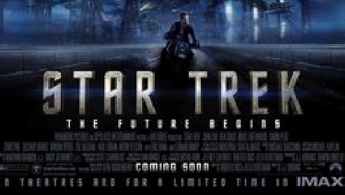
Star Trek.
|
The 'Star Treck' poster connected to our idea of using the Sci-Fi/ Thriller genre. The dominant colours in the poster consist of tones of blue, grey and white- metallic colours seem most apparent which is typical for the genre.
The layout of the imagery is enticing as it shows the main characters as well as a small action clip from the film; the main character is in the foreground with two other significant characters slightly behind. This gives the audience information about who the film features and the importance of the roles that they play- they must have lead roles to take the amount of space that they do on the poster. The use of the action clip underneath the characters is so that the audience recognise the genre and know that there will be sci-fi action in the film; the spaceship and dramatic image of the protagonist moving away from it combined with the name of the film in a futuristic font and colour entice the audience as well as drawing in the old 'trekkie' fans. |

|

|
The use of well known and widely recognised actors taking up a large majority of the poster creates a ready-formed interest within the audience; they are familliar with these faces and therefore are drawn in to want to watch the film before even knowing the content.
The faces are partially in shadow, this gives the overall feeling of the poster and air of mystery and darkness. The use of positioning in the poster gives the audience an indication into the role and importance of the characters shown; the obvious protagonist takes position in the immediate foreground, implying that he has the most significant role within the film. The two other characters are positioned slightly behind him; they are of enough importance to be on the poster but perhaps play a smaller part than the lead male role. |
|
The title 'Star Trek' in a futuristic metalic font further implies the theme of sci-fi within the film. The use of the caption 'The Future Begins' raises questions in the audience's mind without fully answering them; requiring the audience to watch the film.
The image behind the text provides the viewer with a small insight into the action that will be shown in the film, the theme of met |
|
Types Of Poster.

|

|
Busy.
During our lesson, we were asked to analyse different styles of teaser posters in order to make a decision about which type we would most like to work in.
We were given a few examples from each style, the first style that we looked at was 'Busy' with the examples of 'LOTR' and 'Indiana Jones'. The busy theme seems to reflect the content of the film, the hectic layout and composition of the poster represents the busy action genre. The key features shown in these are; the key characters, significant places, objects and a colour scheme which is consistent through the film. It seemed apparent that there wasn't one single image captured in a creative way, rather several images placed together to form an artistic layout. In addition to this, all of the images of the faces seem to stem from the centre of the poster, where the protagonist's face takes the main place; appearing to become more significant the closer they are to the centre.
Minimal.
The 'minimal' approach to posters is much more subtle than the busy theme. There seemed to be only one character shown on the poster, this keeps the audience focused on the image, or character, shown and doesn't allow them to be distracted. This approach automatically raises questions in the viewer's mind such as 'who are these characters' and 'why are they of significance'.
Additionally, these posters consist of less images and usually contain one simple image which has clever photography with sophisticated lighting techniques and flattering colour schemes and moods.
Extreme Close-Up.
The expression of the face in these posters plays a bigger role in portraying the 'theme' of the film than in the others; these appear to be less focused on objects and settings and use an emotion-filled facial expression to provide the audience with an insight into the mood of the film. Futhermore, the only give away into what the film may be about is the expression and the minimal words provided on the poster.
The expression of the face in these posters plays a bigger role in portraying the 'theme' of the film than in the others; these appear to be less focused on objects and settings and use an emotion-filled facial expression to provide the audience with an insight into the mood of the film. Futhermore, the only give away into what the film may be about is the expression and the minimal words provided on the poster.
Manipulation.
The use of combining two images/objects in a clever way shows the audience what the film may be about. Objects/themes seen in these posters give clues as to what the main themes within the film may be. For example, guns hint at action/thriller genre. These objects are often seen again throughout the film or play some kind of significant role.
In addition to this, the fact that these posters seem to have one main focal point means that the audience is not distracted from the image of significance.
Planning.

|
Initial Plan; Selecting The Style of Poster.We began by deciding on what style of poster we should create after researching the different types and layouts of poster.
For a 'busy' themed poster it was apparent that we would have to show factors such as; the protagonist, antagonist and other characters of significance (in this case, the scientist) as well as main settings an locations, including shots of London and the Gherkin. If we wanted to go with a 'minimal' or 'extreme close up' style of poster, we would have to carefully select the most significant character in our trailer and portray them to the audience in a stylish and creative way. The minimal approach would have been the 'face to face' scene from our trailer of the clones facing one another; however we decided that this gave away too much of the storyline and didn't leave much to wonder about. Furthermore, the 'ECU' approach went in the opposite direction and would mean that not enough about the film was given away. This left us with our idea for a 'manipulation' style of poster, our first idea for this style was to use an ECU of the protagonist, with a repeated image of the clone within his eye- as though they are reflected and therefore showing the audience what the protagonist's character is seeing. |

|
Final Plan.After reviewing and receiving feedback about our initial idea for our poster, we decided to change the whole plan and idea.
It seemed that our first plan may appear fake and unrealistic because of the sheer amount of photoshop manipulation that would be required to create it successfully. We had agreed that we should use objects to represent the themes within the film; initially thinking that we should use russian dolls to imply the theme of clones and the idea that one comes from another identically. However, in the end we agreed that we would use a chessboard to represent the one powerful leader (the king piece) in charge of all of the clones (pawns are the pieces that are sacrificed in a game of chess) while one single piece stands out and represents the initial clone that is sent back (the one white pawn). The use of different colour pieces would imply the good vs evil theme; black pieces connoting the idea that they are evil and white pieces implying the idea of good and purity. We also decided that the antagonist should be shown in the background behind the chessboard; using moody lighting in the style of Pierro to slightly conceal his face and further imply the idea of him being evil. This composition also shows the the antagonist watching over the game of chess; reenforcing the idea of his control over the empire. |
